Neo-Noir's Neon Problem: When Style Stands In for Substance
The genre that dressed itself in colour and sometimes forgot to say anything
Contents
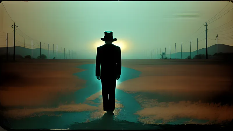
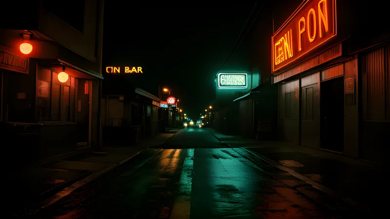
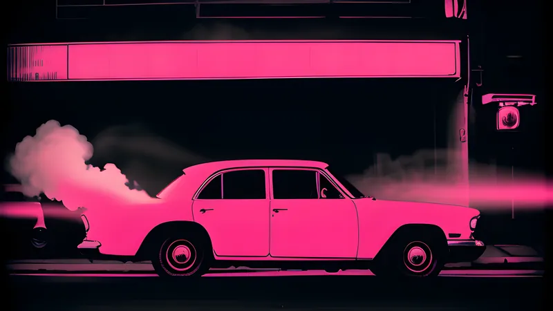
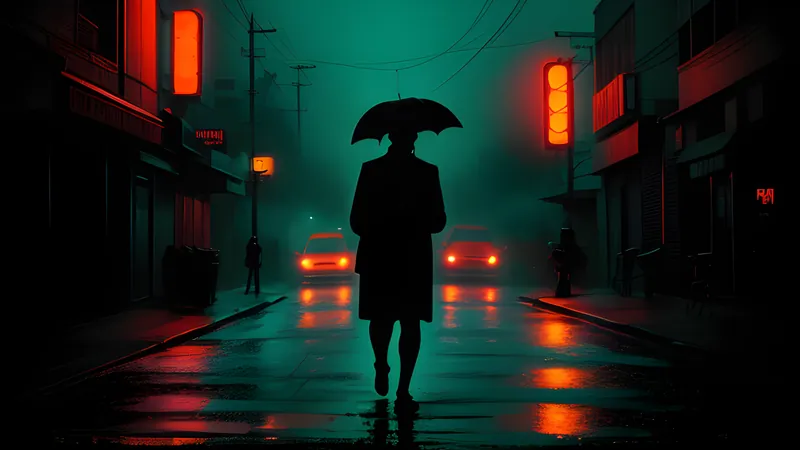
There is a particular image that neo-noir has spent the last fifteen years falling in love with. A lone figure, half-lit, standing in a corridor or a car or a hotel room bathed in aggressive magenta and cyan, holding a pose while a synthesiser throbs on the soundtrack. It is a gorgeous image. It has launched a thousand posters and ten thousand Instagram grids. And it is the exact point where the modern crime film keeps getting into trouble, because that image is doing so much work to feel meaningful that a filmmaker can forget to make it be meaningful. This is neon-noir’s central problem, and it is worth diagnosing precisely, because the same technique that produces the genre’s best recent work also produces its emptiest.
Classic film noir was born in black and white for reasons that were half budget and half poetry — cheap to light, and morally legible, a world of shadow where the darkness meant something. Neo-noir inherited the shadows and then, somewhere around the neon-drenched 1980s and with gathering intensity after 2010, discovered colour as a substitute for the old chiaroscuro. Sometimes the colour carries the meaning the shadows used to. Sometimes it is a very expensive way of having nothing to say. Telling the two apart is a skill worth developing.
When the neon means something
Start with the defence, because the style earns its keep more often than its detractors admit. Colour, deployed with intent, can externalise a character’s interior in a way dialogue never could, and the best neon-noir uses its palette as psychology rather than decoration.
The case study everyone reaches for is Nicolas Winding Refn’s Drive (2011), and rightly, because it is the film that set the template the rest chased. Its washes of hot pink and cold blue are keyed to its silent driver’s split nature — the tender fantasist and the sudden brute — and the colour does the characterisation the near-wordless script withholds. I have argued the case at length in Refn’s neon fairy tale with a hammer: the style is load-bearing there, a fairy-tale grammar of colour that lets the film operate as myth rather than crime procedural. The neon is saying something about how the driver sees himself, and the gap between the dream palette and the abattoir violence is the whole point.
Dan Gilroy’s Nightcrawler (2014) makes the case from the opposite direction, using the sodium-lit sprawl of nocturnal Los Angeles as a moral landscape for a predator with a camera. The city’s electric glow is not pretty there; it is the sickly light of a place that rewards exactly the ghoul the film is studying, and I have written about how the camera and the ghoul of Los Angeles fuse until the aesthetic becomes an indictment. In both films the surface is expressive. Strip the colour and you lose meaning, which is the test of style that has earned its place.
When the neon means nothing
Now the prosecution. The trouble with a technique this seductive is that it photographs beautifully whether or not anything is happening underneath, and a generation of imitators learned the look without learning the reason for it. The result is a whole subgenre of films that mistake a mood board for a screenplay.
Refn himself, ironically, is the most instructive offender, because he is capable of both. Only God Forgives (2013) and The Neon Demon (2016) take the Drive palette to hallucinatory extremes while hollowing out the human content that made Drive work, until the films become gorgeous, glacial exercises in surface — every frame a painting, and the paintings adding up to a shrug. Reasonable people disagree about these films, and provocation has its defenders, but the honest viewer can feel the difference between a colour scheme externalising a soul and a colour scheme standing in for the absence of one. The magenta is identical. The meaning has evaporated.
The mechanism of the failure is worth naming, because it is a trap any stylist can fall into. Colour and score operate on the audience’s nervous system faster than plot or character can, priming an emotional response before the film has done anything to deserve it. A held shot of a bruised-purple room over a swelling synth feels like grief or menace or longing, and the feeling arrives whether or not the story has built toward it. A skilled director uses that head start to amplify meaning that is genuinely there; a lazy one uses it to fake meaning that is not, borrowing the physiological response and paying nothing back in story. The audience is moved for a moment and left, on reflection, with nothing to hold — the cinematic equivalent of a sugar rush.
The imitators downstream are worse, because they have the aesthetic vocabulary and none of the craft that justified it. You know the type: a retro-synth score, a neon-soaked palette, a brooding loner, a plot borrowed wholesale from better films, and a conviction that the mood is the movie. These films treat style as a destination when the classics treated it as a delivery system. A red filter is not a theme. A synth arpeggio is not a character. The look is doing the emotional labour the writing declined to do, and past a certain point the audience can feel the hollowness through the gorgeousness, the way you can feel a smile that does not reach the eyes.
The test the classics pass
The way out of the confusion is to look at what earned neo-noir does that empty neo-noir cannot, and the cleanest demonstrations are the films that barely need colour at all because their style is welded to substance from the first frame.
Roman Polanski’s Chinatown (1974) is sun-bleached rather than neon-lit, and its style — the golden California light, the slow unpeeling of corruption — is inseparable from its argument about power and rot, a film I have called the noir that poisoned its own ending because its bleakness is earned by everything that precedes it. The Coen brothers’ Blood Simple (1984) wrings expressionist dread out of a Texas bar and a stretch of highway on almost no money, its style a set of precise choices about suspense rather than a filter laid over the top; it remains a masterclass in the perfect small crime. And Michael Mann, the patron saint of the beautiful crime film, built his glassy nocturnal aesthetic on a foundation of process and professional obsession, so that the gorgeousness in Thief means something about the men it photographs — the birth of a style that later imitators copied at the surface and never at the root.
Here is the test those films suggest. Take any neon-noir and ask what the style is externalising — a character’s psychology, a world’s moral weather, an argument the film is making. If you can name the thing the colour expresses, the style is earning its keep. If the honest answer is “it looks cool,” you are watching wallpaper, however expensive the wallpaper is.
The same test exposes why the classic black-and-white noirs remain the genre’s spine. Their shadows were an economy that became a philosophy — a way of hiding what the budget could not build, which hardened into a moral vocabulary where darkness meant compromise and the single shaft of light meant a fading chance. The technique was never separable from the worldview. Neon-noir inherited the vocabulary and too often forgot the grammar, keeping the striking image and dropping the reason it was striking.
Why it matters more than it seems
This is not a niche aesthetic quibble. The neon problem is really a symptom of a wider drift in a certain kind of ambitious filmmaking, where the tools for creating mood have grown so powerful and so cheap that mood can be manufactured with almost no underlying reason for it to exist. Colour grading, retro scoring and slow-motion swagger are available to anyone now, and they produce a competent facsimile of profundity on demand. The danger is a cinema that feels meaningful while meaning nothing, that hits the emotional notes without earning them, and that trains audiences to accept atmosphere as a substitute for thought.
The correction is simple and unfashionable: demand that the style say something. The great neo-noirs, from Chinatown to Drive, do exactly that, and their colour is legible as an argument about the people inside it. The empty ones offer the same surface with the argument removed, and the tragedy is that they often look identical in a trailer. Learn to feel the difference and the genre opens up — its glow becomes a language again, and you stop being dazzled long enough to notice whether anyone is speaking.
Related Content