Colour Versus Black-and-White in the Horror Image
Two ways of frightening the eye, and why the genre keeps switching between them
Contents
Horror had to be black-and-white before it could choose to be. The genre grew up inside a monochrome medium, learned all its earliest tricks there, and then, when colour arrived and swept through every other kind of film, kept quietly wandering back. A director in 2019 can shoot in glorious digital colour and decide, on purpose, to drain it to grey. That decision is never neutral. Monochrome and colour are two different machines for frightening the eye, and the interesting thing is that neither one ever fully won.
What the dark used to hide
The first great lesson of the black-and-white horror image was economy. A shadow costs nothing and conceals everything, and a monster you never quite see is a monster the audience finishes for you out of their own worst material.
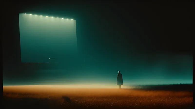
The Universal cycle of the 1930s built its whole grammar on this — the tilted shadow on the wall, the pool of dark a creature steps out of. But the purest theorists of the hidden were Val Lewton’s unit at RKO in the 1940s, who had no money for monsters and turned the shortage into a style. In Cat People (1942), the fear lives entirely in what the frame withholds — a swimming pool lit by rippling reflections, a sound in the dark, a shape that may or may not be there. Lewton grasped that black-and-white is a subtractive medium: it takes information away, and the missing information is where terror breeds. You can trace a straight line from his shadows to The Innocents (1961), whose deep-focus monochrome keeps a figure ambiguously present at the edge of the image, and to Robert Wise’s The Haunting (1963), which frightens with a bending door and a breathing wall and shows you no ghost at all. Monochrome is the natural home of the thing you never see.
There is a documentary quality to it too. When George Romero shot Night of the Living Dead (1968) in black-and-white — partly a budget decision — he inherited the look of newsreel and press photography, and the film gained an awful reportage authenticity that a colour version would have softened. Grey death looks like something that already happened, in a real place, to real people. Hitchcock chose monochrome for Psycho (1960) for related reasons: it made the shower killing readable rather than lurid, kept the whole thing closer to a cheap true-crime paperback, and dodged the censors who would have balked at red.
What colour did when it arrived
Then Hammer opened the curtain on the blood. When the British studio launched its gothic cycle with The Curse of Frankenstein (1957) and Dracula (1958), the shock was chromatic: Technicolor gore, arterial and glistening, in an era when audiences had only ever seen horror in grey. Christopher Lee’s Dracula bled, and bled in colour, and the genre discovered that colour is an additive, aggressive medium. Where monochrome hides, colour asserts. It puts the wound on the screen and dares you to look at it.
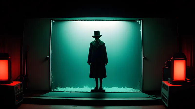
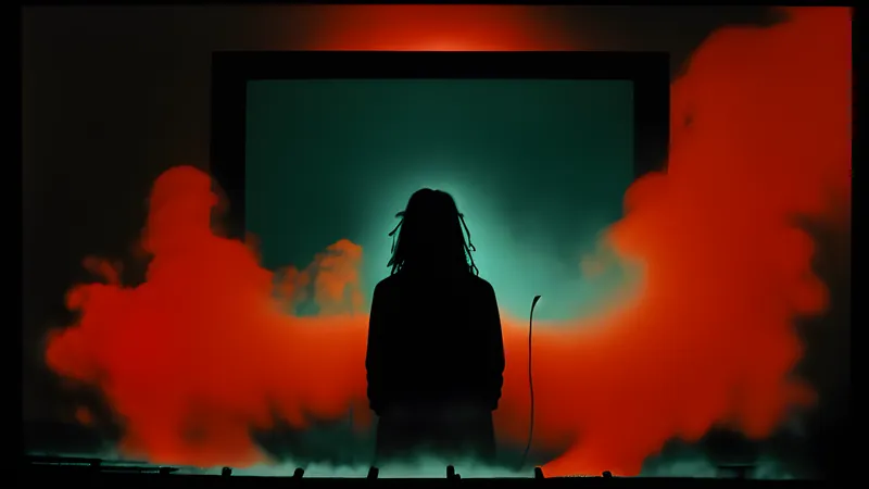
From there colour became a language of its own, and its greatest stylists treated it as expression rather than description. Mario Bava, the father of Italian horror, flooded his sets with saturated gels — hot magenta, poison green, unmotivated blue — so that a room’s lighting told you how to feel before a single thing happened in it. His Blood and Black Lace (1964) is essentially a fashion catalogue lit like a fever. Dario Argento pushed the idea to its limit in Suspiria (1977), one of the last films to use the old dye-transfer Technicolor printing process, which let him render reds and blues at an intensity later stocks could not match. The famous set-pieces of his colour-as-weapon giallo Deep Red work on the same principle: the palette is not realistic and is not trying to be — it is a direct line to the nervous system, bypassing story entirely. This is the whole art of colour timing as horror, carried decades later into the neon dread of Refn’s Drive.
The tinted middle ground
The clean opposition between grey and colour hides a messier truth: the earliest horror was rarely pure black-and-white at all. Silent prints were routinely tinted, whole scenes dyed a single hue — amber for interiors, blue for night, sometimes a wash of red for fire or fury. F. W. Murnau’s Nosferatu (1922) survives in versions where Count Orlok stalks through blue-tinted night and steps into amber lamplight, so the film was already using colour as mood a full generation before Hammer made blood run red. Tinting was a blunt instrument compared with Bava’s gels, yet it proves the instinct was always there: filmmakers wanted the emotional temperature that only colour supplies, and reached for the crudest available version of it.
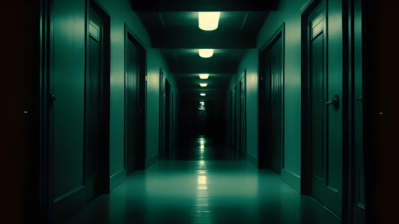
The reverse experiment runs through the sound era, when directors kept discovering that pulling colour out could frighten better than leaving it in. Even inside a colour production, a horror film will often stage its worst moment in a space drained to near-monochrome — a snow-blind white, a sodium-lit yellow murk, a scene lit so cold it reads as grey. The palette becomes a dial the film turns down at the exact moment it wants the eye to feel starved.
Why the eye reacts differently to each
The split is not merely aesthetic; it is perceptual, and the craft mechanics explain why directors keep choosing between them.
Colour carries emotional temperature directly. Red reads as blood and alarm before any conscious thought; a sickly green reads as decay; cold blue reads as isolation. A colourist can therefore pre-load a scene’s mood into its very light, which is why Bava and Argento could make a room threatening while nothing in it moved. The cost is that colour also anchors an image in the specific and the physical. A red wound is that wound, in that light, at that moment — vivid, and therefore finite.
Monochrome trades all that emotional shorthand for abstraction and suggestion. It flattens the world into tone and contrast, which pushes the image half a step towards dream and memory, and it forces the eye to read shape and shadow rather than local colour. That abstraction is why a black-and-white monster dates so much more slowly than a colour one: you are not looking at a specific latex texture in a specific hue, so your imagination stays in the loop, filling gaps the film has deliberately left. The sound built into these frames does the rest, because a shadow with the right creak in it needs no colour to be unbearable.
The deliberate return to grey
Which brings us to the modern choice, the one that proves the whole argument: a filmmaker with every colour available who reaches for none.
Robert Eggers shot The Lighthouse (2019) in black-and-white and a near-square 1.19:1 frame, evoking the silent era and boxing two men into a claustrophobic column of grey. The monochrome is doing real work — it strips period specificity, turns salt and storm and lamplight into pure tonal menace, and makes the whole thing feel dredged up from an older, stranger cinema. David Lynch had done something adjacent with Eraserhead (1977), whose greasy monochrome renders an industrial nightmare no colour palette could make so airless. And where a contemporary film keeps its colour, the horror-literate ones often bleed it half away: desaturated, ashen, the chroma turned down until the world looks sick. The choice is always available, and the genre keeps making it in both directions.
Even films that keep their colour often stage the argument internally. Alejandro Amenábar shot The Others (2001) in fog-bound greys and candlelit browns, a palette so desaturated it hovers a step from monochrome, and the drained colour is inseparable from the film’s twist told through a child’s fear — a world that looks half-faded because it is. Robert Eggers, before The Lighthouse, gave The Witch (2015) a muddy, sunless colour scheme where the only real red is firelight and blood, so that when either appears it detonates. Both directors are working the same seam: keep the colour, but ration it until absence becomes the point.
That is the real conclusion. Colour and black-and-white are not a technological progression where one replaces the other. They are two permanent tools, each frightening in an opposite way — one that hides and one that attacks — and the strongest horror films are the ones whose makers knew exactly which machine they were switching on. The anthology tradition proves it in miniature, cutting between eras and looks in a single sitting. Watch enough of them and you stop asking which is scarier. You start asking which fear the director wanted, and whether they picked the right eye to frighten it with. That instinct — grey to hide, colour to wound, and the whole dial in between — is one of the oldest working tools the genre owns, and every new folk-horror parable of a family and a wood or neon giallo revival reaches for it again. The technology keeps changing. The choice never goes away.
Related Content