Colour Timing as Horror: From Bava to Refn
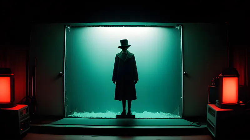
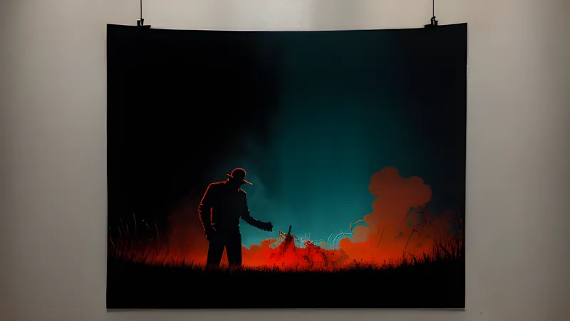
When a film floods the frame with a red or a blue that no lamp in the room could explain, it has stopped describing the world and started scoring your nerves
Contents
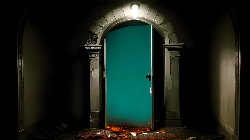
There is a moment in Suspiria (1977) where a young dancer walks down a corridor and the walls are a red so total, so unbroken by any plausible source, that the colour reads as a temperature rather than a decor choice. No lamp in the building could make that red. That is the entire point. When a film pours a hue across the frame that the physics of the scene cannot account for, it has quietly announced that you are no longer watching a record of the world — you are inside someone’s fear, painted directly onto the screen. This trick has a lineage, and it runs from a run-down Italian studio in the early 1960s to a Danish provocateur working in Los Angeles neon fifty years later.
Call it colour-as-weapon. It is one of the oldest tools in genre cinema and one of the least understood, because it works on a channel that bypasses the story entirely.
Bava, or how to light with poison
The founder is Mario Bava, and he arrived at the technique partly through poverty. Bava was a cinematographer before he was a director, the son of a special-effects man, and he understood light as a tradesman understands his materials. Working on tiny budgets at the dawn of the 1960s, he lit sets with coloured gels — sheets of tinted gelatine clipped over lamps — throwing saturated red, green and violet across faces and walls in defiance of any realistic source. In Blood and Black Lace (1964), the film that effectively invented the stylised body-count murder mystery, a mannequin-filled fashion house glows in candied, unnatural colour while women are killed inside it, and the prettiness of the light makes the violence worse rather than softening it.
Bava’s insight, the one everyone after him inherited, is that colour and realism can be unhooked from each other. A gel does not describe where the light is coming from; it describes how the scene feels. His haunted rooms are lit like nightmares because a nightmare has no continuity supervisor checking that the green glow has a lamp. Blood and Black Lace is the ur-text, and every gel-soaked corridor in horror for the next sixty years is quoting it, knowingly or not.
Argento and the last of the Technicolor dye
Dario Argento took Bava’s gels and industrialised them. His early gialli, above all Deep Red (1975), already treated a splash of red — a curtain, a wall, arterial blood — as a compositional event, the eye yanked to it like a bell being struck. But the masterpiece of colour-as-horror is Suspiria, and its power owes as much to a dying industrial process as to Argento’s eye.
Argento and his cinematographer Luciano Tovoli deliberately sought out one of the last facilities still capable of the three-strip Technicolor imbibition process — dye-transfer printing, the same technology that made The Wizard of Oz and Snow White glow. It laid colour onto the print as actual dye rather than as a photographic emulsion, producing reds and blues of a density that ordinary film stock simply could not hold. Tovoli lit the ballet academy with saturated primaries thrown against white walls, and printed it through this process, so that Suspiria looks like a Grimm fairy tale that has begun to rot from the inside. The colours are beautiful and they are wrong, and the wrongness is the horror. A witches’ coven does not need to be explained when the light itself has turned malevolent.
The craft lesson is precise. Argento uses colour the way a composer uses a key change — as an emotional signal that arrives before the audience can rationalise it. He deepened the method through Inferno and then, in Tenebrae, flipped it entirely, shooting a giallo in flat, glaring white daylight so that the absence of his signature shadow became its own kind of dread. He understood colour well enough to frighten you by withholding it.
Why unmotivated colour works on the nerves
It is worth being technical about why this lands, because the effect is not vague. Colour is processed by the brain fast and pre-verbally — you register a red before you have identified what object is red. A filmmaker who floods a frame with an unmotivated hue is therefore firing directly at an involuntary system, ahead of the part of you that builds narrative sense. By the time your reasoning catches up and asks “why is that room green,” the dread has already been delivered and cashed. This is why colour horror survives translation and even bad projection better than a clever plot twist does: a twist can be spoiled and a monster can be over-shown, and a wall of impossible red simply arrives, every time, on a channel the audience cannot defend against.
Realistic lighting keeps you oriented; you always know where you are and where the light is from, and orientation is calming. Unmotivated colour cuts that anchor. When the source vanishes, the ground goes soft, and the audience floats in a space governed by feeling rather than physics — which is exactly the state a horror film wants you in. This is the same principle that makes a glimpsed creature more frightening than a fully lit one: both remove a fixed point the audience was using to stay safe. Georges Franju understood the poetry of the tactic decades earlier — Eyes Without a Face is monochrome, but its cold, silvered light performs the same job, using tone in place of hue to make beauty and horror the same image.
From the lab bench to the grading suite
There is a technical shift worth naming, because it changed who controls the colour. In Bava and Argento’s era, colour was fixed photochemically — chosen on set with gels, then adjusted at the lab through “timing,” a technician setting the printer lights that determined how each shot’s colour balance came out on the release print. Colour timing was a craft with real limits; you were bending the behaviour of dye and emulsion.
The digital intermediate changed everything. Once a film is scanned and graded in software, a colourist can push any part of any frame toward any hue, region by region, with no physical constraint at all. This is how modern stylists work, and it is why the palettes got more extreme. It also introduced a danger the old process was protected from by its own difficulty: colour became cheap, and cheap effects get overused until they mean nothing. The strongest modern colourists impose the discipline the lab used to impose for them. You can watch the discipline fail all over contemporary cinema, in the reflexive teal-and-orange grade that flattened a decade of blockbusters into the same two complementary colours — colour used as a house style rather than as meaning. Bava’s gels were crude by comparison and infinitely more expressive, because every colour choice cost him something and therefore had to say something. Constraint, as so often in genre filmmaking, was the mother of the effect.
Refn: the colour-blind man who sees in neon
Which brings us to Nicolas Winding Refn, the clearest living heir to Bava’s poison-light. Refn is red-green colour-blind — he has said he cannot perceive midtones and sees the world in high contrast — and rather than hide this he built a style out of it. Drive (2011), shot by Newton Thomas Sigel, bathes Los Angeles in electric pink, hot amber and cold blue, using neon and practical sources pushed to extremes so that the whole film reads in the strong, separated colours Refn can actually see. The famous elevator scene switches to a soft golden glow for a kiss and then hard fluorescent white for violence within the same shot, the light editorialising on the action in real time.
He pushed it further into outright horror with Only God Forgives (2013) and The Neon Demon (2016), where Los Angeles becomes a Bava set — corridors of pure red and blue, faces lit by colours with no plausible source, beauty and menace fused into a single frame. Refn is doing exactly what Bava did with gelatine sheets in 1964, with a grading suite instead of gels and a physiological reason to trust high-saturation colour over naturalism. The gonzo maximalist Gaspar Noé works the same seam — Enter the Void and Climax drown the frame in strobing red so that colour becomes an assault on the body directly.
What to watch, chromatically
Programme it as a single evening and the lineage teaches itself. Start with Blood and Black Lace to see the technique invented out of gels and necessity. Move to Deep Red and then Suspiria for the industrialised peak, ideally Suspiria in a restoration that preserves the dye-transfer density — a washed-out transfer robs it of the entire effect, so seek out a good one. Then jump the decades to Drive and The Neon Demon and watch a colour-blind director arrive at Bava’s conclusion by a completely different road. Argento’s colour language is worth its own deep dive into the glass and the glove; it is the richest single body of work in the whole tradition, and it began with a man clipping tinted gelatine over a lamp because he could not afford anything better.
Related Content