Cover Art Lies: The Box-Art Era
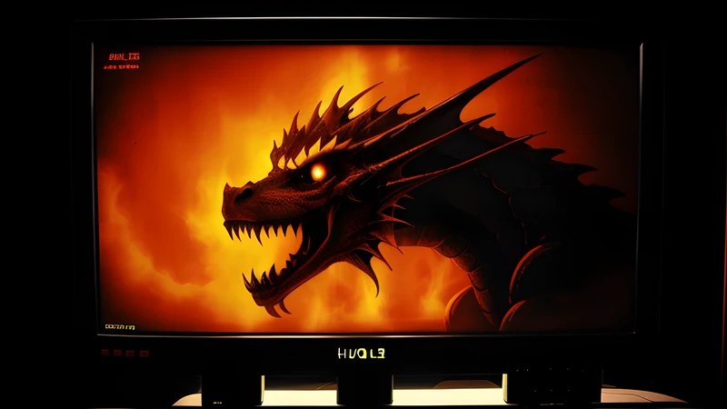
The airbrushed dragon was part of the rendering pipeline
Contents
Roger Dean drew Yes album sleeves. Floating islands, impossible arches, that logo. In 1984 a new Liverpool outfit called Psygnosis hired him to draw their owl, and then to paint their boxes — Brataccas, Obliterator, Barbarian, Shadow of the Beast — and for the rest of the decade a Psygnosis game looked, on a shelf, exactly like a prog rock record. The company understood what it was selling. Ian Hetherington, David Lawson and Jonathan Ellis were selling a feeling, in a shop, to someone who could not see the game.
Everyone did this. Bob Wakelin’s airbrush fronted Ocean’s catalogue through the eighties. Mastertronic put painted art on games costing £1.99. The Atari 2600 had established the extreme case a few years earlier, wrapping four coloured rectangles in a fully rendered oil painting of a jungle adventure, and the gap between the two became the founding joke of games marketing.
The joke is lazy, though, and I want to argue the opposite. The box art was doing real work. It was, functionally, part of how the game rendered.
Eight pixels cannot be frightening
A Commodore 64 sprite is 24 pixels wide and 21 tall, in one colour, or 12 by 21 if you want three colours by pairing them. That is your monster. That is the entire budget for menace.
No amount of pixel craft makes that object frightening on its own terms. What makes it frightening is that you have spent the previous six minutes — and you had six minutes, because the tape was loading — looking at a painting of a thing with wet teeth, on a box, in your hands. The painting installs a referent. The sprite then indexes it. Your brain composites the two, and it does so willingly, because brains are much better at this than machines were.
This is the part the “cover art lies” joke misses entirely. The player was in on it. Nobody looking at Pitfall!’s box expected the 2600 to produce that image; the image told you what the rectangles meant, and the meaning is what you played. Composite rendering, with the expensive half done in oils and the cheap half done in silicon, and the compositor sitting on the carpet.
The manual did the same job in prose. Elite shipped with a Robert Holdstock novella so that three vector lines could be a Cobra Mk III. Cinemaware built entire games out of the technique — It Came from the Desert is a B-movie poster with a game arranged behind it, and the poster is load-bearing. When the hardware cannot show you a world, the packaging becomes the world, and the software becomes an index into it.
So the era’s art was a legitimate craft with a real brief, and it was practised by people at the top of their trade. Dean was a fine artist doing commercial work. Wakelin was very good. That whole discipline is now extinct and has never had a proper retrospective.
Where the lie was actually a lie
Now the honest half, because there was fraud in this, and it concentrated in two places.
The budget shelf. Mastertronic and its rivals sold games for £1.99, and at that price the cover was the entire pitch — no reviews, no demo, no shelf space for a description. Some of those games were superb; the budget label was a genuine democratisation and put more good software into more British bedrooms than anything before Steam. Some of them were forty minutes of work with a painting on the front, and a child’s pocket money was the entire risk model. The painted box turned a shop into a lottery, and the house had a very good edge.
The technically honest catastrophe. Shadow of the Beast (Psygnosis, 1989) is the case study, and it is more interesting than a straight con. Roger Dean’s cover promised an epic. The game delivered thirteen layers of parallax, a Tim Wright soundtrack that people still put on, and combat with roughly one idea in it. The box was not lying about the ambition; the parallax genuinely did sell Amigas, and the thing on screen was as astonishing as the thing on the box. It just had nothing to do once you got there. Psygnosis’s house failure was always art running ahead of design, and their catalogue reads as art first, game second — an accusation the company’s own output makes rather better than any critic could.
Compare the Bitmap Brothers, who arrived with as strong a visual identity as anyone in Britain and put a real system underneath it. Style was substance there: the chrome and the riveted metal in Speedball 2 describe a game about violence as an economy, and the game is about violence as an economy. The look was a thesis rather than a promissory note. That is the distinction the era mostly failed to make and the Bitmaps mostly made.
The screenshot on the back was worse
The painting on the front gets the blame, and the genuine deception was usually on the reverse.
A British publisher in 1988 released a game across five or six incompatible machines at once — Spectrum, C64, Amstrad, Amiga, ST, sometimes MSX — from one licence, with conversion teams of wildly varying quality and about eight weeks each. One box design covered all of them, sold in one shop, off one shelf. So the screenshots on the back were frequently taken from the best version, and the child buying the Spectrum cassette was looking at Amiga pixels.
Nobody was breaking the law. The small print named the platform, and the industry considered it normal practice. It also meant the single most trustworthy-looking piece of evidence on the package — an actual photograph of the actual software — was the element most likely to mislead, while the airbrushed dragon was, in its way, scrupulously honest, because it never claimed to be a screenshot of anything.
The multi-format conversion was the era’s real scandal and it barely gets discussed. A great arcade licence would arrive on the Amiga as a straight port of the coin-op and on the Spectrum as a different game entirely, built by two people in a rented room, and both were sold as the same product at nearly the same price. The magazines were the only defence, which is why Zzap!64 rating a conversion at 34% was an event with commercial consequences, and why a fifteen-year-old in 1988 could tell you which reviewer he trusted by name.
Information killed it, and killed the art with it
What corrected the bluff was not better taste. It was data.
The British magazines got there first. CRASH launched in 1984, Zzap!64 in 1985, both from Newsfield in Ludlow, and their innovation was the screenshot page — the game as it actually appeared, printed at some size, next to a percentage. A £9.95 purchase became researchable. The covertape went further and let you play the thing; distributing playable software on a magazine’s front was, structurally, the first demo culture, and it made the painting decorative rather than evidential.
Then the screen caught up. Once a PlayStation could render a face, the box no longer had to imply one, and cover art collapsed within about five years into a photograph of the protagonist’s head at three-quarter angle against a grey gradient. There is nothing for an airbrush to do when the software can out-render it.
And then Steam finished the job with policy. Capsule art rules ban review scores, award laurels and marketing copy on the image itself. Refunds — under two hours played, within fourteen days, since 2015 — make the bluff structurally unprofitable: you can simply take the game back. Wishlists, Next Fest demos, a video that autoplays. The modern shop gives a buyer more evidence in nine seconds than a 1987 buyer could assemble in a month, and the painted promise has nowhere left to operate.
That is a straightforward win for consumers and a real loss to the visual culture of the medium, and both of those things are true at once.
The era’s ghost
The tradition survives in one place, which is indie key art, where a small team with no marketing budget still has to say what a game feels like in one image to somebody scrolling. And it survives, gloriously, as content: UFO 50 fabricates fifty games and fifty box promises for a console that never existed, and the joke only lands because everyone still remembers what it felt like to be sold a world by a painting and handed a grid of sprites.
The airbrush was never lying, exactly. It was describing a game the hardware could not yet draw, to a player willing to draw it themselves. The whole arrangement depended on the player’s imagination doing about sixty per cent of the work, and the medium’s history since 1994 is the story of taking that work away and calling it progress. Which it was. The dragon still looked better than the sprite, and everyone knew, and everyone bought it anyway.
Related Content